Minecraft Wiki:Moving from Fandom/Skin feedback - minecraft.fandom.com
This page is for gathering feedback on the new wiki skin and deciding whether the light or dark theme should be made the new default.
This skin is now live on the new wiki; please see this discussion page for more details and leave further feedback about the skin there.
Overview[]
The Minecraft Wiki community has come to a consensus after multiple discussions (see first and second discussion) that we should move to a different host. The wiki will now have a different layout than Fandom's, so the community has been working on a new skin to match over the past weeks. This has also given us the opportunity to put more focus into a proper dark theme.
The new skins have now mostly been finalized, though there are still a few minor tweaks remaining. We would like to take the opportunity to present them to the wider wiki community for feedback. We believe that the new dark theme is in a better state than ever, so we would also like to consider whether the dark theme should now be made the default. You can see screenshots of the new skins down below, or check them out for yourself here.
Please provide feedback and leave your vote on which theme should be the default skin in the discussion section. Also, feel free to join the wiki’s Discord server to provide additional feedback there.
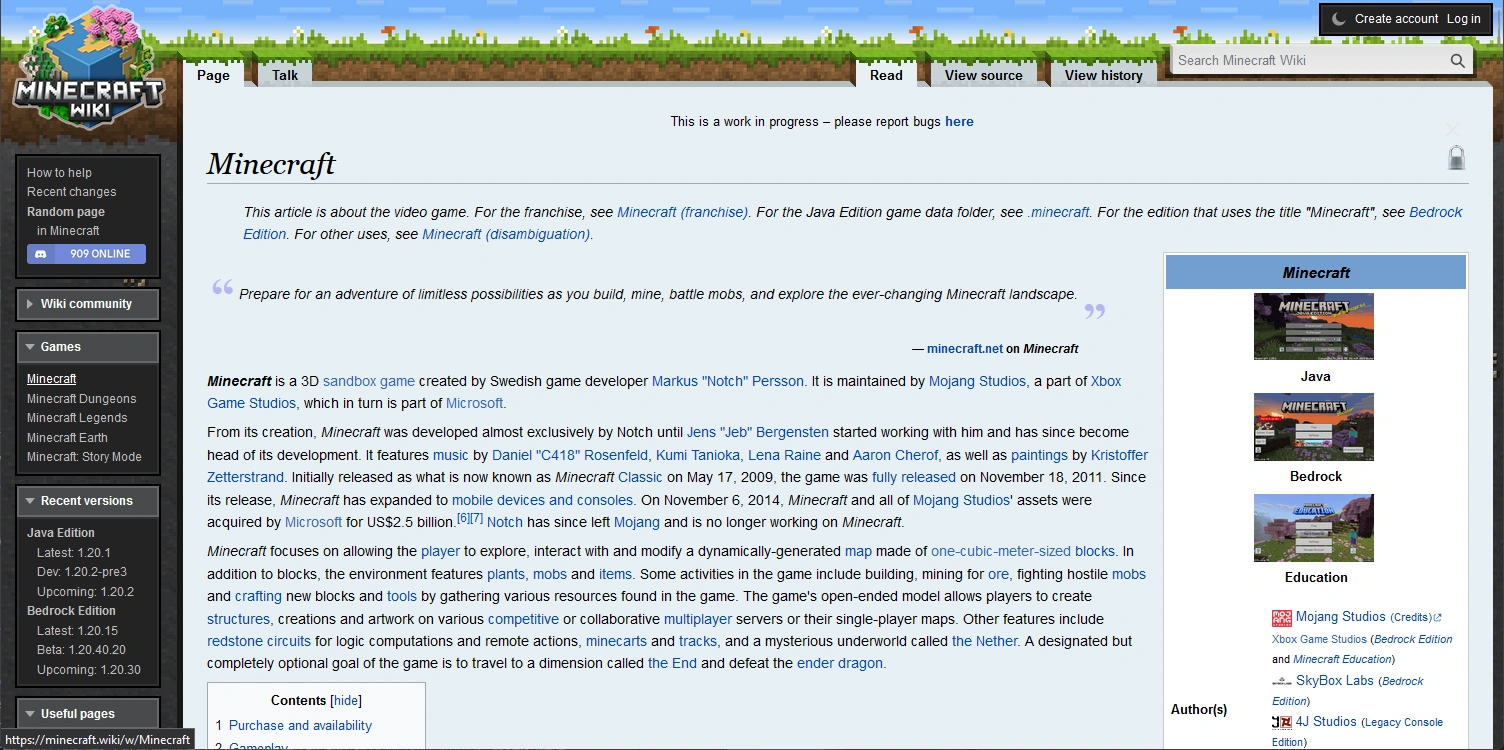
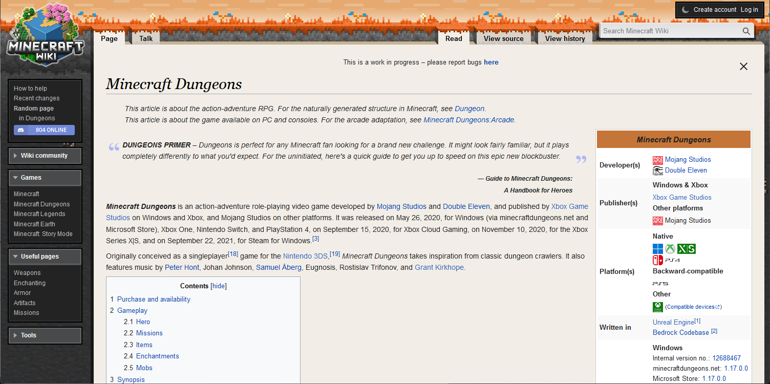
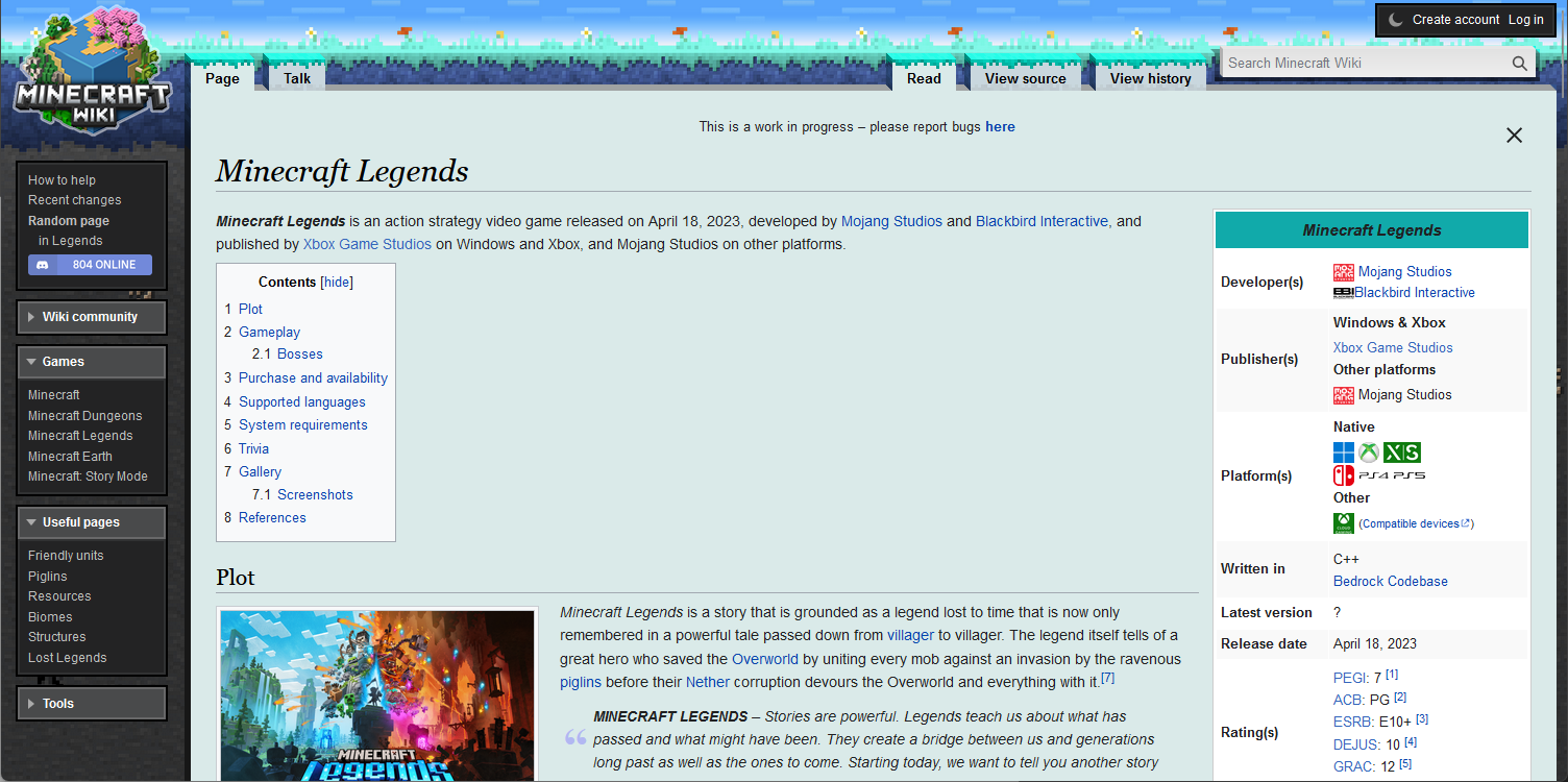
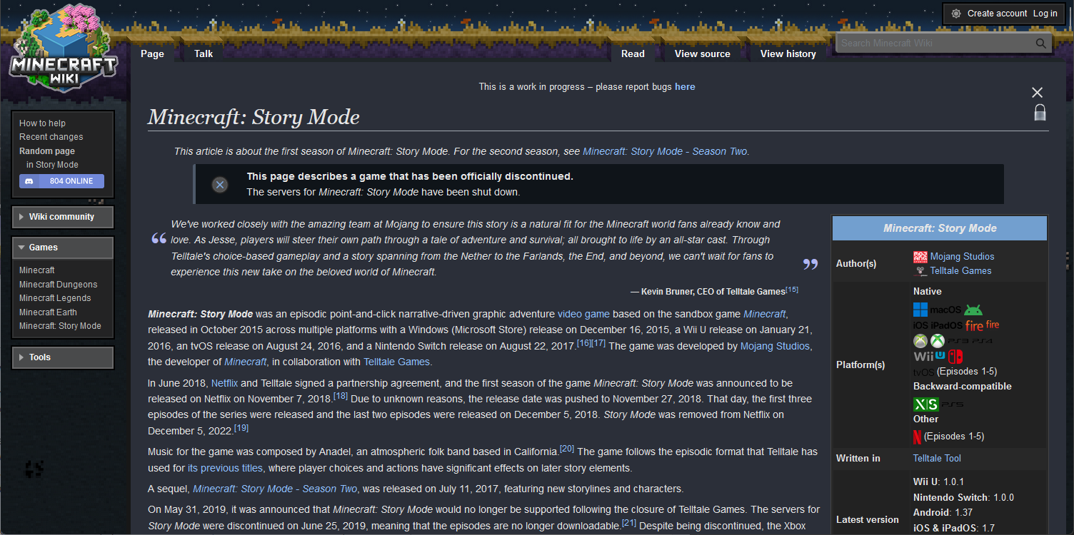
Light theme[]
-
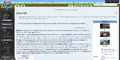 Minecraft
 -
 Dungeons
 -
 Legends
 -
 Earth
Earth -
Story Mode
Dark theme[]
-
Minecraft
-
Dungeons
-
Legends
-
Earth
-
Story Mode


Discussion[]
Oppose setting dark mode as the default skin. It looks good but there are things to tweak (for example the search bar in the provided screenshots has low contrast) and I wouldn't be surprised if it wasn't 100% perfect at launch - the wiki has always been designed with light mode as the default after all. Personally I also find it harder to read. --Capopanzo (talk) 00:24, 22 September 2023 (UTC)
Oppose. Light mode feels just right on the wiki. Keep it as the default. Zenphia (talk) 13:54, 22 September 2023 (UTC)
Suggestions to improve the search bar. As complained above, some people think it's too small. So how about if the 5 buttons at the top of the article would be in a single group on the left? That would let the search bar be much bigger (more visible). Also, why not put some kind of an additional few pixel wide frame around the search bar? And in the dark mode the "Search Minecraft wiki" text has very poor contrast. GMRE (talk) 14:56, 22 September 2023 (UTC)
Oppose I prefer the light theme. GMRE (talk) 14:58, 22 September 2023 (UTC)
Oppose Light mode looks better, however Support having a dark mode option. TheTrubbleMushroom (talk) 19:39, 22 September 2023 (UTC)
Oppose I prefer the light theme and the wiki has been designed around that theme. Minermatt122514 (talk) 19:42, 22 September 2023 (UTC)
Oppose per consensus above (at the time of my writing at the moment), regarding setting dark mode as global systemwide default for all. Support having a dark mode option that users can set their own default preferences. Delvin4519 (talk) 19:53, 22 September 2023 (UTC)
I prefer light mode as the default, I don't see a need to change the established default. I am a really big fan of all the design work done though! We can continue to tweak things slightly, but I think things are looking very solid currently. A massive improvement if you ask me. - Harristic (talk) 20:15, 22 September 2023 (UTC)
IMO the light mode looks better as a default. But it looks like it will be very easy for people to switch. Anomie x (talk) 20:38, 22 September 2023 (UTC)
Oppose I would keep the light theme as the default. Support for dark mode, however. PJronq (talk) 02:42, 23 September 2023 (UTC)
Light mode is the most intuitive viewing mode for any new-comer, and best for presenting the website. As for what mode the viewers will choose when they've familiarized themselves, is their own choice. Luotiansha (talk) 05:58, 23 September 2023 (UTC)
Oppose for having dark mode as default but Support for having an easy way to switch to it if the user wants.Mr. trex 2021 (talk)
Oppose dark mode as the default theme. TheGreatSpring (talk | contribs) 15:03, 23 September 2023 (UTC)
Oppose making dark theme the default. Although I'm a little biased since I use light mode everywhere, (even on Discord :P), the site themes you've made here are especially nice looking. Also wanted to mention that the mobile layout of the development wiki is much nicer than currently on Fandom, but could still use some work. I wonder if this new host allows for having a different layout for the mobile website, versus the desktop and tablet versions. Support Definitely support being able to switch to dark if someone wants to though. Hydroquake (talk) 15:08, 23 September 2023 (UTC)
Oppose I would prefer default to be light, but Support allowing the user to choose what they like, with an option to use the OS setting. AD OffKilter (talk) 17:29, 23 September 2023 (UTC)
IMO, the default theme shouldn't be light or dark - it should be the system preference, with an option to change to dark or light, depending on that system preference. --osfanbuff63 (talk) 19:19, 23 September 2023 (UTC)
Oppose having a dark mode by default, as it is just not standard. The other feedback I've got is:
- Remove serif headers, it doesn't look very nice.
- Change the textures of the background to the official ones. If that is not possible, recreate them in 8x8 but don't make them look like Terraria, especially the dirt. The blending is also not Minecrafty. However, the main page heavily uses textures, can't the background use real textures too?
- Change the logo font, as I said on the discord, it is a pixel font that is not the minecraft (logo or menu) one, that looks weird.
- Move Discord down a bit.
- Better align the search bar with the tabs: change its colour to fit and have it the same size, and put grass on top.
- I see you're forcing Liberation Sans, interesting? My Linux Arial replacement of choice is FreeSans, could you move it down the stack a little to allow users to choose, or just use
system-uiorsans-serif? - The main page with its sections is so nice, really had to change it up after many years!
- For the Minecraft row on the main page, a more logical order would be Blocks/Items/Mobs/Biomes/Effects/Structures/Crafting/Smelting/Enchanting/Brewing/Smithing/Archeology/Trading/Redstone/History/Tutorials.
- Beside Latest versions, a chronological version history, possibly with tabs for Java/Bedrock/Education/Legends/Dungeons should be added too.
- For the alt skins (Dungeons/Legends/Earth/SM), the logo could be changed.
- The logo text looks slightly better now because there is no weird texture anymore.
- Pictures should be bigger by default.
- The ore pattern is really repetitive. 3 of them fit on a screen.
- It would be nice if the footer were deepslate.
- Finally, we got the Wikipedia mediaviewer with file pages, no ads and finally, it has a correct order!
- Bigger dark drop shadow for the logo?
- Kudos on dark mode. Really comfy.
- Very controversial, but I would love if the sidenav were sticky and had a separate scrollbar.
- In dark mode, unselected tabs have low contrast.
- In light mode, star icon has very low contrast.
Otherwise, nice skin. Also consider enabling a vanilla Vector 2022 for people who need less clutter. Gugalcrom123 (talk) 06:30, 24 September 2023 (UTC)
Oppose Light mode is better. Because when I imagine a typical Minecraft landscape, players are most actively crafting or building during the day. Pneuma01 (talk)
Oppose the dark mode. It looks like I'm the only person here who would absolutely kill for the dark mode to be the default, I always think dark mode looks better in everything, but looking at this page, that one's proooooobably not gonna be the winner. The light version seems to fit the game more. Support having users be able to pick either one. --XZippy (talk) 12:49, 26 September 2023 (UTC)
Oppose dark mode. I like light mode more. K1401986 Talk with me My edits